Where is the bathroom please?

“BIM” for the conceptual architect
March 15, 2021
The first French vertical forest
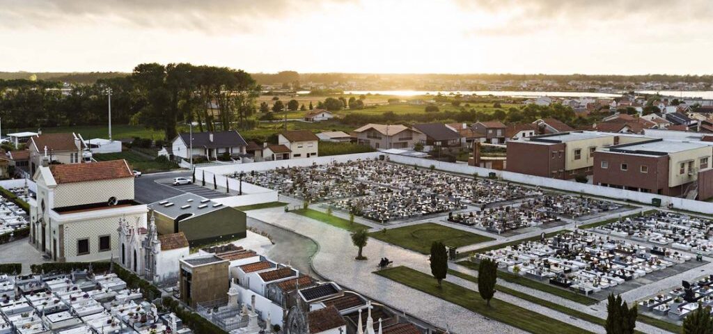
March 15, 2021The idea of using ceramic tile cladding was natural. And it was evident: the ceramic tiles had to be green. The object must be more related to the natural elements, and less to the elements built, highlighting the church that is so close. To achieve this, to create a uniform and neutral object, the ceramic tile had to cover the entire building, from the facades to the roof. But then comes the reality: the technical and economic reality, and with good reason! The workers did not know how to do it. And the schedule? It was expensive? The design solves everything! We add some plasters to optimize the stereotype of the tiles and to reduce the technical difficulties. A work team!
Through the two masses extracted in the facades we entered the building. On the south side, we access the new facilities to support the staff of the cemetery workers. The main entrance from the north takes us to the central space, inside the building, but with exterior characteristics, indicated by the natural light and the Portuguese pavement on the floor (the sidewalks that surround the continuity of the building). Here, there are the toilets: a space that functions as a pivoting area, between the feminine, masculine and accessible facilities.
This is a building without technology, which means that it is the wind (reinforced by the north-south orientation) that dehumidifies and renews the air. Townhouses in the pre-existing walls we have a wooden roof frame with a white glaze. All interiors are white and have natural lighting through skylights, which reinforces the luminous comfort. The marble basins combine with the exterior objects of the cemetery. The candle burner is a sturdy piece made of black painted iron despite the delicate design. Together, these two objects reinforce the hierarchical network of the cemetery, which does not stop being, by the scale and the synthetic unit, plus its “salt and pepper shakers”.


